Tuesday, February 12, 2019

Typography

Pre-Production

When choosing quotes, I had two before hand that I planned on doing, and found the other two on the Internet. For fonts, I downloaded a bunch so I would have many to choose from, and some specifically I thought would work.

Production

Once I got into Illustrator, I began by typing all the quotes out in to text boxes. Once I had the text typed out I began moving it around to try to find a layout I liked. I went through the fonts I had and chose fonts I thought fit the quotes. Working in black and white was a lot simpler, but I enjoyed working in color more as it opens up more options.


Post-Production

I think 2 of my quotes show how impactful color can be, as the J.R.R Tolkien quote changed a lot when going from black and white to color, while the George Strait quote was barely changed when using color. I wish I came up with more I could change when adding color to the George Strait quote, but other than that I am happy with how my designs turned out.


Monday, December 17, 2018

S1 Final

1st Semester Graphic Design

Info-Graphic

The goal of this project was to put together an Info-Graphic about a topic of our choice. This project has taken around a month to do. I started by doing research on my topic, which ended up being centered around music listening. Then I made several smaller sketch mock-ups and then a larger, more detailed final mock-up. Once those were all done I began create the graphics for the Final Info-Graphic. Once the graphics were finished I began piecing together the final Info-Graphic. Some of the graphics were hard to make initially and finding colors that both worked together and made the words easy to read was somewhat difficult. During this project I learned how to use the pen tool much better than I ever had before. When working on my final sketch I was told that I may not have enough color which I thought was true. I ended up adding more and different colors and arranged it differently than some of my original sketches. I think my Info-Graphic looked pretty good at the end.

Challenge 2

For this project we were given the challenge of finding many different photos form Unsplash.com and putting them together into one photo using Photoshop. This project took around a week to finish. I think the hardest part of this project was finding the photos and making the colors look consistent. This project gave me more good practice using Photoshop. I started out working with a color palette of purples and ended up going with blues. I really liked the final product of this project.

Panorama 

For this project we had to take 10 photos around a theme and put them together in photoshop. This project took around 2 weeks to complete. It was hard to get all ten photos into one while still keeping the focus. Since I did used sunrise/sunset I only had certain times I could get photos as well. I learned that it is better to have more picture than needed just incase some that I thought would work don't. I was told that it would look better if the transitions were smoother that it would look and flow better. I originally wanted to have more main photos but I thought that the focus was better with fewer main photos. I thought that this project look alright but could have been better.

Final Thoughts 

Almost all of these projects took up all of the time we were given to do it so I didn't finish up earlier than expected a majority of times. The few times I did finish early I tried to do touch-ups or find tutorials or other things to learn from. Outside of class I took or found photos that worked for some of these projects.
I think some of my strengths as a graphic design student would be flexibility and listening to feedback. I change my thoughts around a lot while working and enjoy implementing feedback I am given into my work.
I think I could improve in communication and leadership by asking for more feedback from others and offering feedback on others work.
I enjoyed learning more about graphic design and photography and learning how to use Photoshop and Illustrator way better than I knew how to use them before. For next semester I would like to continue to learn more about using Photoshop and Illustrator better and to also continue to make my projects better and better.

Behance:https://www.behance.net/tystockwel3ece

Tuesday, November 6, 2018

Water Color Transfer

1. The Process


To start this process you must print off a picture and cut it out. You then need a piece of water color paper. You then water color the paper however you want to. They you apply mod podge to the back of the picture. Generally the more mod podge the better. You then put the picture on the water color paper and press it down. You can use a squeegee to push out and bubbles under the picture. You then need to let it sit out for a while and dry. Once it is dry you can start to remove the printing picture to show the transfer print. To remove the picture you can put your fingers into water and rub the water across the paper. once water has been rubbed across the paper you can start to push down harder keeping water on your fingers. It is easiest to start pushing it off from one of the corners. You have to push hard enough to get the paper off but not too hard to where you remove parts of the transfer. You might have to rub it a couple times to completely remove the paper fuzz. Once all the fuzz is gone you will just have the water color paper and transfer left.

2. My prints

I think that I should have applied more mod podge at the start so that the picture transfer would have been better. When I went there were no clean squeegees left so that made removing bubbles harder. But I think I did a good job removing the paper with water.

Tuesday, October 16, 2018

Printing Processes

Image result for relief printing Relief Process
The Relief Printing Process uses wood or linoleum that is carved onto to make white areas. The grain of woods can give the blacks a different look then plain linoleum. Ink is then applied then a paper is pressed on top to get the final print. The relief process begins with either a wood block or a linoleum block. When using wood you begin by toning the block with an Indian ink wash or jet black film ink. This is used to make a black ground area so that when pieces of the wood are removed it is very clear and distinct. A drawing can then be transferred to the wood with the help of an iron oxide or carbon paper transfer. Once the drawing has been transferred the artist can carve pieces of the wood out to create white spaces. Ink is applied evenly on the wood and a baron is used to push down a paper with even pressure onto the wood to get the final print. When using linoleum, you can use a marker to draw straight onto the plate or use the same transfer strategy used with wood. You can carve into the linoleum just like you would with the wood except it takes less pressure. The inking process is the same.

Intaglio Process
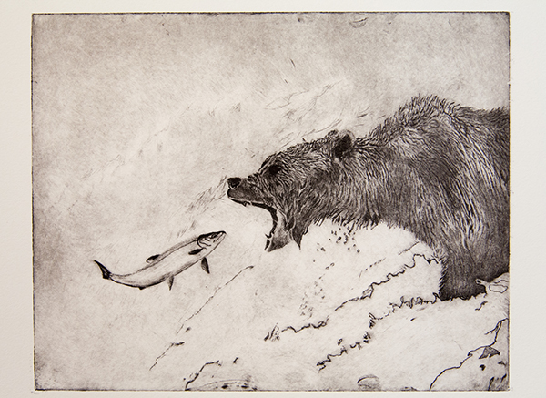
Image result for intaglio printingThe Intaglio Process uses metal which is either moved to create burrs that hold ink or creating a soot that can be scratched off. Once that is finished, ink is pushed and a press is used to put high pressure on a paper above for the final print. Artists like this technique as it gives off a sculptural look.
When performing Dry Point you move away parts of the metal with etching tools to create burrs that hold ink. Once the artist is done Steel Facing can be performed which increases surface strength to help insure none of the burrs break during printing.
Another technique is Etching. A ground is applied to the plate, then it is heated to become soot. Once this has occurred the surface will be a jet black. To draw, the artist barely scratches the surface so that the copper becomes visible as the soot moves away. This provides an area for the ink to go into. Once the artist is done drawing the plate is submerged in a bath of acid this eats away at the bare copper areas so that they can more easily hold ink. This is done for 15 minutes then it is taken out and washed off then bathed again for 15 minutes. Ink is then wiped on the image. After that, the access ink is wiped off. Then paper is put over the metal and put under a press at high pressure.
.

Lithography Process

Image result for lithographyThe Lithography Process is very intricate process using grease and anti grease to get an image. Lithographic pencils and Lithographic crayons are used to draw on the lithographic stone. The drawn on parts can be easily removed with things like razor-blades. The inking process is longer and takes a lot of trial and error.
In this process the artist draws directly onto the stone to start. Once the artist is done drawing Gum Arabic is applied. Once the stone receives the Gum Arabic, acidified Gum Arabic is applied, Tapem for example, which helps keep the Gum Arabic bonded to the stone. Some of the material is then removed and then Gum Arabic is reapplied. Cheesecloth is then used to push the materials into the stone. Asphaltum is then used to replace the drawing material. This creates a greasy base which the ink will be able to replace. The image with then disappear slightly to become a ghost image. If the image is etched properly the ghost image will still be somewhat clear. Then the surface is wet down slightly, dried, then sponged, and immediately inked. Before inking paper, the ink is pushed down into the stone. The softness of paper can give off a different tone. A good inking is found when you can see the hand motion marks on the paper.

Testing One

I would like to try Intaglio Process, because it seems more simple then the others, and I like the general look it gives off. It seems like it would be fairly similar to normal drawing as well. I think some of the looks and feels these types of printing gave off are still trying to be captured by modern artists even if they aren't using these processes.

Monday, October 15, 2018

Personal Narrative

I get to a spot where I can see the sun rise or set. It is relaxing to just sit and watch. The fresh air outside feels great. I hear nothing but wild animals and trees in the wind. The weather outside is perfect.
I relax and watch as the sun comes up over the horizon, into view or while it slowly fades away as the moon comes up on the other side. It is a beautiful sight to open up or close out the day.
I relax and watch. For a view moments I forget about the worries of the day ahead of me. As the time passes I think of nothing else. Once it has past I continue the rest of the day.

I chose the main pictures I liked the most and put them in the foreground. I then layered many other pictures behind the main ones to create a different color and feel as well as define the horizon and give the sun rays. I like how it turned out. I like how there isn't too many pictures in the foreground so it becomes crowded. I also liked what the other pictures looked like with the different and somewhat more exaggerated colors.

Monday, October 1, 2018

Pop Art

Pop Art Project:


I started by going outside and taking pictures of my partner that could work. Once we got back inside a picked the picture I thought looked best and started working. I used a black and white adjustment layer and used the color blending mode to make the colors stand out more. I used a layer mask to sharpen the edges of the shirt and used the halftone filter over my partner. I used bright green, blue, and red in parts of the picture, as well as blacks and whites to make the bright colors pop more. I used the brush tool when adding colors back but I also used a splatter brush with the brush tool to add the blacks and whites that make the colors pop. I used the rectangle tool as well to add more color to the background and a slight pattern.

Thursday, September 13, 2018

Landscape Man Challenge

Landscape Man Challenge

For this project I was given a normal picture of a man and told to do whatever I wanted to do using layer masks, adjustment layers, and blending modes. I started by finding some pictures on unsplash.com that I wanted to use. I decided to use two different city-scapes, one for the jacket, and one for the undershirt. I decided to use a night sky to cover his hair. I wanted to change the background color to a darker color to make the man pop out more so I changed it to a gray background and while doing that I thought that the white outline look good so I ran with it.

I came into this without much of an idea of what I wanted to do but when I got on unsplash.com I found the picture of the city I used for the jacket and liked it so I went with it. I found a second picture of a city to add more variety and differentiate the jacket from the undershirt. I thought a starry night sky would look good over the hair so I searched for a picture to use. I used layer masks to put the pictures I found over the places I wanted them to be over. I used a dissolve blend on the hair to change the texture slightly. Finally I used an adjustment layer to make the night sky-hair slightly darker and slightly less saturated. I think that the photo came out the way I was expecting it to.

Semester 2 Final Blog

S2 Final Blog Low-Poly Vector  My favorite project this semester in graphic design was the low ploy vector. I spent around a month...